Introduction
In today’s fast-paced digital world, data is king. Whether you’re a business owner looking to analyze sales trends, a scientist examining research data, or a developer creating an informative dashboard, presenting data in a visually appealing manner is crucial. React, a popular JavaScript library for building user interfaces, is a go-to choice for many developers. And when it comes to data visualization in React apps, leveraging chart libraries is a game-changer.
In this blog, we will explore the significance of data visualization in React apps, the key considerations when selecting a chart library, and how to get started with integrating these libraries into your projects. We’ll delve into creating basic and advanced charts, discuss optimization and best practices, and even provide you with real-world examples for inspiration. So, let’s dive in and take your React app’s data visualization to the next level.
Why Data Visualization Matters
Understanding the importance of data visualization in React apps
Data visualization is all about transforming raw data into insightful visuals. In the realm of React apps, it plays a pivotal role in making complex information comprehensible at a glance. Humans are naturally drawn to visuals, making charts and graphs an effective way to convey data-driven insights. Whether you need to track sales performance, monitor website traffic, or present scientific findings, data visualization enhances user engagement and understanding.
How it helps in presenting complex data in a visually appealing manner
Have you ever tried to make sense of a massive spreadsheet filled with numbers and figures? It’s not an enjoyable task. Data visualization simplifies this process by presenting data in an easy-to-digest format. Charts, graphs, and diagrams offer a visual context that can reveal trends, patterns, and anomalies with just a quick glance. This not only aids in decision-making but also makes your React app more user-friendly and engaging.
Choosing the Right Chart Library
Factors to consider while selecting a chart library for your React app
Selecting the right chart library is crucial to ensure that your React app’s data visualization meets your requirements. Consider factors such as the type of data you’re working with, the complexity of your visualizations, and the level of customization you need. Additionally, think about your project’s performance, compatibility, and long-term maintenance.
Popular chart libraries available for React
There are several chart libraries designed specifically for React. We’ll explore some of the most popular ones, such as Chart.js, Recharts, and Victory, each offering unique features and capabilities to cater to various visualization needs.
If you find yourself uncertain about which library is the best choice, consider reaching out to Tagline Infotech, a leading React Native Development Company. Our team of seasoned React Native developers possesses expertise in a wide range of libraries and can guide you to the optimal solution.
Getting Started with React Chart Libraries
Installing and setting up the chosen chart library in your React app
Before diving into the world of data visualization, you need to set up your chosen chart library in your React project. We’ll guide you through the installation process and help you get everything up and running smoothly.
Exploring the basic usage and configuration options
Once you have your chart library in place, we’ll walk you through the basics of using it in your React app. You’ll learn how to create your first chart and configure its appearance, labels, and data sources.
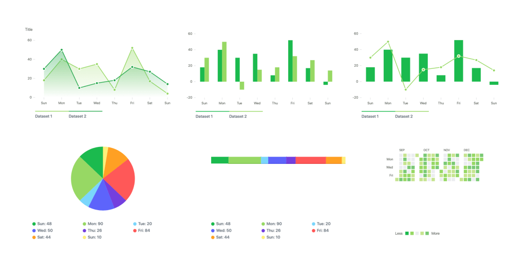
Creating Basic Charts
Creating simple bar, line, and pie charts in React
Now, it’s time to roll up your sleeves and start creating basic charts in React. We’ll cover how to create fundamental chart types, such as bar charts, line charts, and pie charts, allowing you to visualize your data in an intuitive way.
Customizing the appearance and adding data labels
No two projects are the same, and your charts should reflect your app’s unique style and brand. We’ll show you how to customize the appearance of your charts and add data labels to make your visualizations more informative and visually appealing.
Advanced Chart Features
Implementing interactive features like tooltips and legends
Interactive features like tooltips and legends enhance the user experience and make your charts more user-friendly. We’ll explore how to implement these features and give your users the ability to interact with the data.
Handling real-time data updates in charts
In dynamic applications, data can change rapidly. We’ll discuss strategies for handling real-time data updates in your React charts, ensuring that your visualizations remain accurate and up-to-date.
Fetching data from APIs and databases to populate charts
Many React apps rely on external data sources. We’ll show you how to fetch data from APIs and databases and use it to populate your charts, making your visualizations dynamic and relevant.
Integrating with Data Sources
Fetching data from APIs and databases to populate charts
Your data visualization may require real-time data updates and synchronization with external sources. We’ll explore different methods for fetching data from APIs, databases, or even state management libraries like Redux or React Context to ensure your charts stay current and accurate.
Responsive and Mobile-Friendly Charts
Ensuring charts adapt to different screen sizes and devices
In today’s mobile-centric world, it’s essential that your charts adapt to different screen sizes and devices. We’ll delve into responsive design techniques to make your charts look and work seamlessly on both desktop and mobile platforms.
Implementing mobile-friendly interactions and gestures
Mobile devices come with their own set of user interactions and gestures. We’ll guide you on how to implement mobile-friendly interactions to provide an exceptional user experience on smartphones and tablets.
Optimizing Performance
Tips for improving chart rendering performance in React
Performance matters, especially when dealing with complex data visualizations. We’ll share tips and techniques for optimizing chart rendering performance in your React app, including lazy loading and code-splitting strategies.
Best Practices for Data Visualization in React
Choosing appropriate color schemes and chart types for different data
Data visualization should not only be informative but also visually pleasing. We’ll discuss best practices for selecting the right color schemes and chart types to effectively convey different types of data.
Creating accessible charts for users with disabilities
Accessibility is a critical aspect of modern web development. We’ll show you how to create accessible charts, making your data visualizations available to all users, including those with disabilities.
Real-World Examples
Showcasing real-world React apps that effectively use chart libraries for data visualization
To inspire you on your data visualization journey, we’ll present real-world React apps that have successfully implemented chart libraries. You’ll see how these apps use data visualization to provide valuable insights and improve user engagement.
Inspiration for implementing charts in your own projects
Drawing inspiration from real-world examples, you’ll gain insights into how you can effectively implement charts in your own React projects, taking your data visualization to the next level.
Conclusion
In the world of React app development, data visualization is a powerful tool that can set your project apart. Whether you’re building a dashboard, an e-commerce site, or a scientific application, the ability to present data in a visually appealing and user-friendly manner is invaluable. By leveraging the right react chart library, customizing your charts, and following best practices, you can create stunning data visualizations that captivate your audience and deliver meaningful insights.
Now that you’ve embarked on this data visualization journey, you’ll be equipped with the knowledge and skills to enhance your React app’s visual storytelling. So, start exploring the world of chart libraries, and take your data visualization to new heights!
Frequently Asked Questions
What are some popular chart libraries for React apps?
Several popular chart libraries for React apps include Chart.js, Recharts, and Victory. Each of these libraries has its own unique features and capabilities, allowing you to choose the one that best fits your project’s needs.
How do I install a chart library in my React app?
Installing a chart library in your React app is a straightforward process. You’ll typically use package managers like npm or yarn to install the library, and then you can import and use it in your React components. The specific installation steps may vary depending on the library you choose, and we’ll cover this in our guide.
Can I customize the appearance of the charts?
Absolutely! Most chart libraries provide extensive customization options, allowing you to tailor the appearance of your charts to match your project’s style and branding. We’ll explore how to customize charts and make them uniquely yours.
Are these chart libraries compatible with different data sources?
Yes, many chart libraries can work with a variety of data sources, including APIs and databases. We’ll discuss how to fetch and integrate data from these sources into your charts, making them dynamic and up-to-date.
Do these chart libraries offer responsive design features?
Responsive design is a crucial aspect of modern web development. We’ll show you how to make your charts responsive, ensuring they look and work well on different screen sizes and devices, including mobile platforms.


Leave a comment